Gauparivar.com
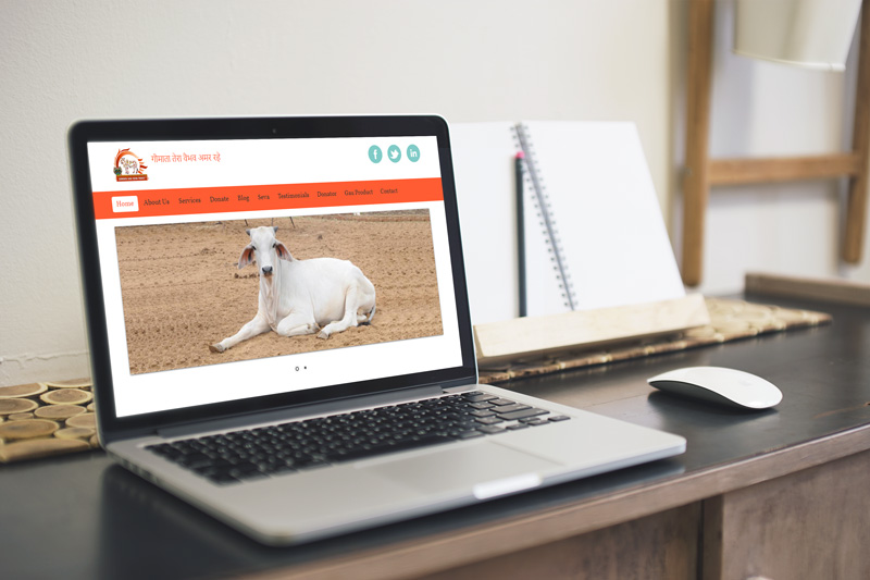
Gomata Gau Seva Trust is launched by a group of individuals who helping ill Cows. Gomata Gomata Gau Seva Trust is located in Vijayawada (A.P) in India.
Gomata Gau Seva Trust is Registered Community by Government of Andhra Pradesh u/s Trust Act.
We recognise that making real improvements in cows health lives means working at both a local and all around India on the underlying causes of poverty in the developing world.
The Goshala the Holy, Intellectual & Spiritual complex being made to know about our Universal Mother "THE COW" in our Fast Kalyug Life. It is the concept of the need for dissemination of knowledge on which the center is based. If it can spark an interest in the philiosophy and outlook of the Indian spiritual system, then it would be very major milestone and a meaningful contribution towards Progress & Prosperity based on a truly invigorating spiritual experience.
We are Gomata Gau Seva Trust committed to work with a dedicated mission of Cow Protection and Avail people to cow importance to the world. We are serving and maintaining a breed pure ‘GIR Cows’ also called ‘GIR Gaiya’ which is purely nourished and well maintained here at Goshala with traditional Indian Vedic way. Even are producing various pure medicines from the raw mistrials from cow such as Cow Urine, Cow Dung and Ghee, and trying to serve that to people as much as to cure diseases.
Gomata Gau Seva Trust respects every living creature alike, no matter whether it is a human being, plant or animal and bird. Arham Yuva Group firmly believs in the Indian culture of living in harmony with the nature and world. That is the reason we are into animal welfare as much as in other welfare activities. We know that being humans, we have luxury of sharing our feelings with others through use of words and languages, but animals? They just cannot share their agonies and grief and pain and wish! That’s why, it is our duty to help them in the best possible way so their lives can become easy whether in night or day.
Our Mission
Our mission is to care for stray, abandoned cows, bulls, retired oxen, and orphaned calves. We provide them hay, flour, fresh grass, clean water, medical attention and a place where they can recuperate from injuries and stay peacefully.
-
To propagate and promote love for the cow and its virtues.
-
To make cow-protection a people's movement.
-
To work for the protection and conservation of cow.
-
To campaign against the cruelty to cow and its progeny.
Our Activities
-
Helpline: We run a helpline where citizens can call to inform about sick or stray cows and calves, in the area.
-
Transportation: In association with volunteers, we arrange to bring the cattle to the campus.
-
Care: We care for the stray, ill-nourished and helpless cows by providing them food, shelter and medical facilities.
Come, join in our mission and make it yours too!!
This is what you can do…..
-
Express your love for cow
-
Propagate the virtues of cow
-
Donate to Gaushalas
-
Adopt a cow & pay for its upkeep
-
Visit a Goshala for regular Goseva yourself
-
Inform us if you see a sick cow or cruelty to cow or its progeny
It’s true, usability has become a commodity.
Over the past few years, we have gotten used to certain standards in web design. In order to make a lasting impression on your visitors, you need to build experiences that go beyond those of a plain, usable website. This does not mean usability has become any less important. It just takes on a different role in web design, now forming the basis for a great user experience.
Usability means user-centered design. Both the design and development process are focussed around the prospective user — to make sure their goals, mental models, and requirements are met — to build products that are efficient and easy to use.
Let’s start with a basic, yet central aspect of usability: the availability and accessibility of your site. If people try to access your website and it doesn’t work — for whatever reason –your website becomes worthless.
Here are a few of the basics of availability and accessibility,
-
Server uptime – It’s important to ensure your visitors don’t get an error trying to load your site. Invest in good hosting.
-
Broken links – Double check that there are no dead links on your site. Nothing sends a visitor back to Google search results faster than a 404 page.
-
Mobile responsiveness – Make sure your site can handle different screen sizes and slow connections.
You could say the core of usability is clarity.
If you distract or confuse your visitors, they will either need more time to find what they came for, or they might forget their initial goal all together. Either way, they will not experience your website as user-friendly and chances are that they leave dissatisfied and with no intention of coming back.
Visitors come to your site with certain goals in mind. It is your job to help them reach these goals as quickly as possible. If you can manage to do that, your visitors will be pleased and you have laid the groundwork for a positive experience.
A clear and usable design can be achieved through:
-
Simplicity – Focus on what’s important. If you don’t distract your vistors they will be more likely to do what you want them to do.
-
Familiarity – Stick to what people already know. There is nothing wrong with looking at other sites for inspiration.
-
Consistency – Don’t get cute. Create a consistent experience across your entire website to keep your visitors mind at ease.
-
Guidance – Take your visitors by the hand. Don’t expect your visitors to explore your site all on their own. Instead, guide them through your site and show them what you have to offer.
-
Direct feedback – Feedback is essential to any interaction. The moment people interact with your site, make sure to offer an indication of success or failure of their actions.
-
Good information architecture – Understand your visitors’ mental models and how they would expect you to structure the content on your site.
Learnability is another important aspect of usability.
It should be your goal to design intuitive interfaces — interfaces that don’t require instructions, or even a long process of trial and error to figure them out. Key to intuitive design is to make use of what people already know, or create something new that is easy to learn.
By now, people are familiar with a lot of design concepts used on the web. By using these concepts consistently, you meet your visitors’ expectations. This way, you help them reach their goals more quickly. As human beings, we like patterns and recognition, which is why we are better at handling familiar situations rather than unfamiliar ones.
If you use new concepts in your design, make sure to use them consistently and give people a hand during the initial learning phase. For example, you can offer additional information, or instructions the first time they use your site or product. Keep it simple and visual to help people remember new concepts.
While the design is very fresh and modern, the layout of the site is classical and in line with what most of us know about websites. At the top left, there is the logo telling us where we are. On the top right, there is a search field, allowing us to search the site for any random term. Below, there is the top navigation menu featuring the central content categories of the site. When clicking on the links, we get a dropdown menu with all the content available within that category.
Then, there is a big visual header element which alternates between four different images. The header is followed by what we know as content area with a vertical sub navigation menu featuring different topics that can be “discovered” and some highlighted content. Below that, there is a social media section and a comprehensive footer area which features Other Microsoft Sites and a lot more secondary links.
The site is very clean and easy to navigate. The familiar layout helps people to quickly find what they are looking for.
Credibility is a crucial aspect of any website.
Even if people find the content they are looking for, if they don’t trust you, that content is worthless. Your website could cause site visitors to be skeptical about your business in any number of ways including whether or not you really exist, your reputation, or the quality of your content.
It is important that people know you are a real company with real people. Offer a clear “About Us” page together with your contact details and if possible a physical address.
Of course your content also plays an important role for the perceived trustworthiness of your site. Make sure you are honest and precise about your content. Avoid mistakes, such as incorrect grammar or misspellings. Don’t be modest about your expertise. If you are an expert in your field, make sure people know it. For example, you can show third-party testimonials, work references, or the number of your social media followers to win your visitors over.
Besides the professional design, which matches the exquisite reputation of the brand, they offer a lot of high quality content to demonstrate their expertise.
For example, an entire content section covers information about Research and Innovation. This shows the engagement of the brand in professional research and reflects the high quality of its products. Another content section addresses Commitments, demonstrating that the brand takes its social responsibilities seriously.
Besides the actual research, the brand also makes use of expert testimonials and photographs of celebrities, such as Julia Roberts, to convince people of the quality and popularity of their products.
Another trust indicator is that it is very easy to get in contact with L’ORÉAL. The brand is not only available via social media, but also a physical address and phone number is easy to find.
Last but not least, relevancy contributes to good website usability.
It is not enough that your website is clear, your content must also be relevant. Again, it is essential that you know your users and why they visit your site.
Start with defining who your users are. Second, talk to them to find out what their goals are when visiting your site.
Third, define user scenarios that demonstrate in which situation people visit your site to find what kind of content.
Any design decision that you make should result in a more user-friendly website for your users.
The brand offers sportswear and equipment for different sports. When coming to their website, you can either choose to browse their store by Men, Women, or Kids, or you can browse by sports. Instead of only grouping people by their age or gender, Nike recognizes their visitors as sportspeople within a certain discipline.
For example, if you are looking for new running shoes, you don’t even care about all the tennis or indoor sports shoes they also have. Nike allows you to browse their store according to your very specific goal.
Get in touch with us
FIZIKA MIND
Best website developer in bareilly
Join our mailing list
Signup for Our Free Newsletter
Education - This is a contributing Drupal Theme
Design by
WeebPal.


